
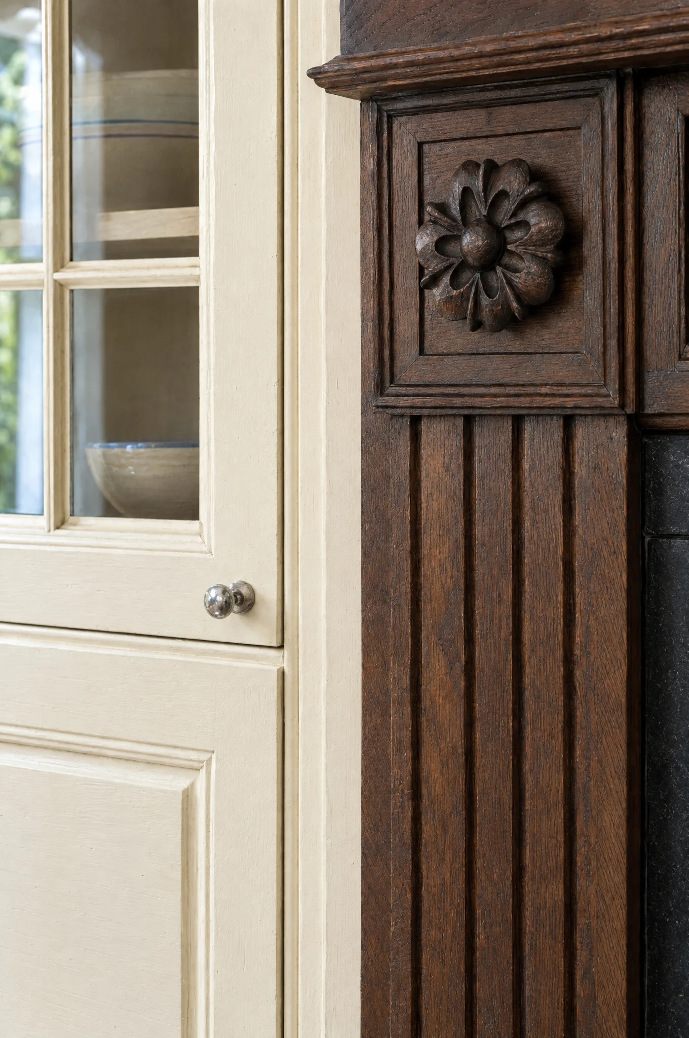
Georgian proportion in a modern kitchen
Proportion is the part of period joinery you cannot buy. It is also the part that survives being put in a room with a steel beam and a bifold door.
Ornament is not proportion
When people say they want a Georgian kitchen they usually mean the ornament: the ovolo, the bead, the fluted pilaster, the dentil cornice. Those things are the easiest part to supply and the least important.
Proportion is the relationship between the parts. It is why a plain eighteenth-century cupboard door with no moulding at all still looks right, and why a door with every correct moulding on it can still look wrong. The mouldings are what you notice. The proportion is what you feel from the doorway before you have noticed anything.
It is also the part that travels. Put a dentil cornice in an extension with a glass roof and it looks like fancy dress. Get the proportions of the doors and drawers right in the same room and nobody can tell you why it looks calm.
The ratios worth carrying in your head
Three, and you can design most joinery with them.
The first: 1 to 1.618, the golden section, which is where a great deal of Georgian door and panel proportion lands whether the joiner knew the number or not. A door 500mm wide wants to be about 810mm tall to sit in that relationship. Most base cabinet doors are shorter and squarer than that, which is why base doors are the hardest thing in a kitchen to make look right and why we so often replace them with drawers.
The second: 3 to 5, or thereabouts, for a panel within its frame. The panel should read as the event and the frame as the border, and a border that is too generous makes the door look mean.
The third, and the most useful: never divide anything into two equal parts. A pair of panels in a door, one above the other, should be unequal, with the lower one larger — commonly around 2 to 3. Equal halves stop the eye. Unequal halves move it.
You do not need to know the theory. You need to avoid the two great errors, which are equal division and centred symmetry where the room is not symmetrical.
Rails, stiles and the bottom rail
In a proper framed door, the bottom rail is wider than the top rail and the stiles. This is not decoration. A door is generally seen from above and at an angle, so the bottom rail foreshortens; make it the same as the top and it will look narrower than the top.
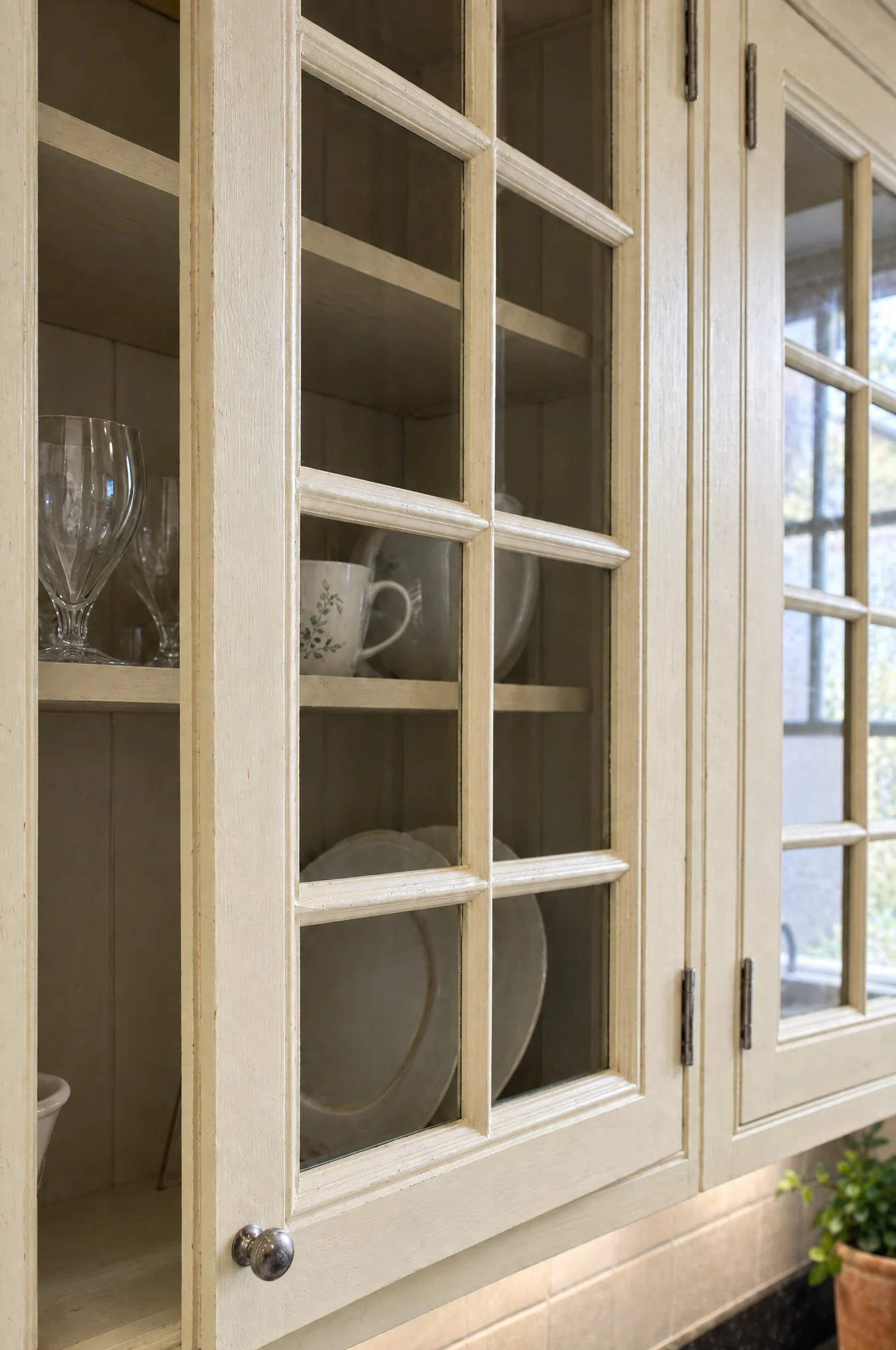
Our standard sections for The Suffolk, which we vary to suit the house: stiles 70mm, top rail 70mm, bottom rail 100 to 115mm, muntin 60mm. On a tall larder door the bottom rail goes to 140mm or more, because there is more door above it to balance.
The frame around the door — the face frame of the cabinet — is 45mm stiles and rails in our work, 20mm thick. Wider than that and the fronts start to look like a wall with holes in it.
Glazing bars, where there are any, should be thin. Eighteenth-century bars are 16 to 22mm wide, and a modern bar at 30mm is the giveaway that a dresser was drawn by someone looking at a photograph.
Graduated drawers
Nothing improves a kitchen elevation as cheaply as graduating a bank of drawers. Three equal drawers in a 900mm cabinet is what a catalogue does. 200, 250, 320 is what a cabinetmaker does, and the increase of roughly a quarter each time is the same progression you see on any decent chest of drawers from 1780.
It is not only aesthetic. The shallow drawer is where the knives and the utensils go, the middle one takes the plates, the deep one takes the pans. Graduation follows use, which is generally why it looks right.
The same principle applies vertically across the whole elevation: base cabinets, worktop, splashback, wall cabinets, cornice. Those horizontal bands should not be equal either.
The lines that are already in the room
Every room has existing horizontals: the window sill, the window head, the door head, the picture rail, the top of the skirting, the change in a wall’s plane. A kitchen looks settled when it lines up with them and unsettled when it misses them by 40mm.
So we survey those heights before we draw. If the window head is at 2,150mm, that is where the top of the tall units wants to be, or the underside of the cornice. If the door architrave is 100mm wide, that is a width worth repeating somewhere. If the skirting is 180mm with an ogee top, the plinth should relate to it — usually a plain plinth of the same height, so the two run as one band around the room.
Plinths, by the way: 100mm in a low room, 125 to 150mm in a room with a decent ceiling. A 150mm plinth in a 2.3m room makes the cabinets look sunk.
Where nothing lines up, which happens in extensions and in houses that have been altered twice, we pick one datum and hold it ruthlessly. One strong horizontal running the length of the room will do more for a kitchen than any amount of detail.
Doing it without pastiche
The failure mode is obvious once you have seen it: a pediment over a fridge, a broken cornice on a bin cupboard, fluted pilasters flanking a dishwasher. Georgian joiners were not applying ornament to appliances. They were making the most of what they had with the geometry they trusted.
So we do the same thing. In a modern room we take the proportion and leave the ornament: unequal panels, graduated drawers, a wider bottom rail, a plinth that relates to the skirting, one held datum, no equal divisions, and a plain frame. It looks contemporary. It also looks like it has been there a while, which is the only compliment that matters.
In a genuine Georgian house we do the opposite and use the ornament too, because the room is already speaking that language and the kitchen should not be the one thing in the house with an accent.
Start a conversation
Tell us about the room, the house and roughly when you would like to be cooking in it. We will tell you honestly whether we are the right people for it.
Make an enquiry